This is the memo of Exploratory Data Analysis in Python from DataCamp.
You can find the original course HERE .
### Course Description
How do we get from data to answers? Exploratory data analysis is a process for exploring datasets, answering questions, and visualizing results. This course presents the tools you need to clean and validate data, to visualize distributions and relationships between variables, and to use regression models to predict and explain. You’ll explore data related to demographics and health, including the National Survey of Family Growth and the General Social Survey. But the methods you learn apply to all areas of science, engineering, and business. You’ll use Pandas, a powerful library for working with data, and other core Python libraries including NumPy and SciPy, StatsModels for regression, and Matplotlib for visualization. With these tools and skills, you will be prepared to work with real data, make discoveries, and present compelling results.
### Table of contents
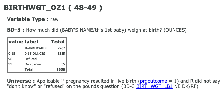
What’s the average birth weight for babies in the US?
When you work with datasets like the NSFG, it is important to read the documentation carefully. If you interpret a variable incorrectly, you can generate nonsense results and never realize it. So, before we start coding, I want to make sure you are familiar with the NSFG codebook, which describes every variable.
How many respondents refused to answer this question?
1
# Display the number of rows and columns
nsfg.shape
# (9358, 10)

# Display the names of the columns
nsfg.columns
# Index(['caseid', 'outcome', 'birthwgt_lb1', 'birthwgt_oz1', 'prglngth', 'nbrnaliv', 'agecon', 'agepreg', 'hpagelb', 'wgt2013_2015'], dtype='object')

# Select column birthwgt_oz1: ounces
ounces = nsfg['birthwgt_oz1']

# Print the first 5 elements of ounces
print(ounces.head())
nsfg.head()
   caseid  outcome  birthwgt_lb1  birthwgt_oz1  prglngth  nbrnaliv  agecon  agepreg  hpagelb  wgt2013_2015
0   60418        1           5.0           4.0        40       1.0    2000   2075.0     22.0   3554.964843
1   60418        1           4.0          12.0        36       1.0    2291   2358.0     25.0   3554.964843
2   60418        1           5.0           4.0        36       1.0    3241   3308.0     52.0   3554.964843
3   60419        6           NaN           NaN        33       NaN    3650      NaN      NaN   2484.535358
4   60420        1           8.0          13.0        41       1.0    2191   2266.0     24.0   2903.782914
In the NSFG dataset, the variable
'outcome'
encodes the outcome of each pregnancy as shown below:
| value | label | | — | — | | 1 | Live birth | | 2 | Induced abortion | | 3 | Stillbirth | | 4 | Miscarriage | | 5 | Ectopic pregnancy | | 6 | Current pregnancy |
The
nsfg
DataFrame has been pre-loaded for you. Explore it in the IPython Shell and use the methods Allen showed you in the video to answer the following question: How many pregnancies in this dataset ended with a live birth?
nsfg.outcome.value_counts()
1    6489
4    1469
2     947
6     249
5     118
3      86
Name: outcome, dtype: int64
In the NSFG dataset, the variable
'nbrnaliv'
records the number of babies born alive at the end of a pregnancy.
If you use
.value_counts()
to view the responses, you’ll see that the value
8
appears once, and if you consult the codebook, you’ll see that this value indicates that the respondent refused to answer the question.
Your job in this exercise is to replace this value with
np.nan
. Recall from the video how Allen replaced the values
98
and
99
in the
ounces
column using the
.replace()
method:
ounces.replace([98, 99], np.nan, inplace=True)
# Replace the value 8 with NaN
nsfg['nbrnaliv'].replace([8], np.nan, inplace=True)

# Print the values and their frequencies
print(nsfg['nbrnaliv'].value_counts())
1.0    6379
2.0     100
3.0       5
Name: nbrnaliv, dtype: int64
If you are careful about this kind of cleaning and validation, it will save time (in the long run) and avoid potentially serious errors.
For each pregnancy in the NSFG dataset, the variable
'agecon'
encodes the respondent’s age at conception, and
'agepreg'
the respondent’s age at the end of the pregnancy.
Both variables are recorded as integers with two implicit decimal places, so the value
2575
means that the respondent’s age was
25.75
.
# Select the columns and divide by 100
agecon = nsfg['agecon'] / 100
agepreg = nsfg['agepreg'] / 100

# Compute the difference
preg_length = agepreg - agecon

# Compute summary statistics
print(preg_length.describe())
count    9109.000000
mean        0.552069
std         0.271479
min         0.000000
25%         0.250000
50%         0.670000
75%         0.750000
max         0.920000
dtype: float64
Histograms are one of the most useful tools in exploratory data analysis. They quickly give you an overview of the distribution of a variable, that is, what values the variable can have, and how many times each value appears.
As we saw in a previous exercise, the NSFG dataset includes a variable
'agecon'
that records age at conception for each pregnancy. Here, you’re going to plot a histogram of this variable. You’ll use the
bins
parameter that you saw in the video, and also a new parameter –
histtype
– which you can read more about
here
in the
matplotlib
documentation. Learning how to read documentation is an essential skill. If you want to learn more about
matplotlib
, you can check out DataCamp’s
Introduction to Matplotlib
course.
# Plot the histogram
plt.hist(agecon, bins=20)

# Label the axes
plt.xlabel('Age at conception')
plt.ylabel('Number of pregnancies')

# Show the figure
plt.show()

# Plot the histogram
plt.hist(agecon, bins=20, histtype='step')

# Label the axes
plt.xlabel('Age at conception')
plt.ylabel('Number of pregnancies')

# Show the figure
plt.show()

Now let’s pull together the steps in this chapter to compute the average birth weight for full-term babies.
I’ve provided a function,
resample_rows_weighted
, that takes the NSFG data and resamples it using the sampling weights in
wgt2013_2015
. The result is a sample that is representative of the U.S. population.
Then I extract
birthwgt_lb1
and
birthwgt_oz1
, replace special codes with
NaN
, and compute total birth weight in pounds,
birth_weight
.
# Resample the data
nsfg = resample_rows_weighted(nsfg, 'wgt2013_2015')

# Clean the weight variables
pounds = nsfg['birthwgt_lb1'].replace([98, 99], np.nan)
ounces = nsfg['birthwgt_oz1'].replace([98, 99], np.nan)

# Compute total birth weight
birth_weight = pounds + ounces/16
# Create a Boolean Series for full-term babies
full_term = nsfg.prglngth >=37

# Select the weights of full-term babies
full_term_weight = birth_weight[full_term]

# Compute the mean weight of full-term babies
print(np.mean(full_term_weight))
# 7.392597951914515
In the previous exercise, you computed the mean birth weight for full-term babies; you filtered out preterm babies because their distribution of weight is different.
The distribution of weight is also different for multiple births, like twins and triplets. In this exercise, you’ll filter them out, too, and see what effect it has on the mean.
# Filter full-term babies
full_term = nsfg['prglngth'] >= 37

# Filter single births
single = nsfg['nbrnaliv'] == 1

# Compute birth weight for single full-term babies
single_full_term_weight = birth_weight[single & full_term]
print('Single full-term mean:', single_full_term_weight.mean())
# Single full-term mean: 7.40297320308299

# Compute birth weight for multiple full-term babies
mult_full_term_weight = birth_weight[~single & full_term]
print('Multiple full-term mean:', mult_full_term_weight.mean())
# Multiple full-term mean: 5.784722222222222


The GSS dataset has been pre-loaded for you into a DataFrame called
gss
. You can explore it in the IPython Shell to get familiar with it.
In this exercise, you’ll focus on one variable in this dataset,
'year'
, which represents the year each respondent was interviewed.
The
Pmf
class you saw in the video has already been created for you. You can access it outside of DataCamp via the
empiricaldist
library.
gss
       year  sex   age  cohort  race  educ      realinc   wtssall
0      1972    1  26.0  1946.0     1  18.0   13537.0000  0.889300
1      1972    2  38.0  1934.0     1  12.0   18951.0000  0.444600
...     ...  ...   ...     ...   ...   ...          ...       ...
62462  2016    2  61.0  1955.0     1  16.0   65520.0000  0.956994
62463  2016    2  67.0  1949.0     1  13.0          NaN  1.564363
62464  2016    2  57.0  1959.0     1  12.0    9945.0000  0.956994
62465  2016    2  56.0  1960.0     1  12.0   38610.0000  0.478497

[62466 rows x 8 columns]
# Compute the PMF for year
pmf_year = Pmf(gss.year, normalize=False)

# Print the result
print(pmf_year)
1972    1613
1973    1504
...
2014    2538
2016    2867
Name: Pmf, dtype: int64
Now let’s plot a PMF for the age of the respondents in the GSS dataset. The variable
'age'
contains respondents’ age in years.
# Select the age column
age = gss['age']

# Make a PMF of age
pmf_age = Pmf(age)

# Plot the PMF
pmf_age.bar()

# Label the axes
plt.xlabel('Age')
plt.ylabel('PMF')
plt.show()


In this exercise, you’ll make a CDF and use it to determine the fraction of respondents in the GSS dataset who are OLDER than 30.
The GSS dataset has been preloaded for you into a DataFrame called
gss
.
As with the
Pmf
class from the previous lesson, the
Cdf
class you just saw in the video has been created for you, and you can access it outside of DataCamp via the
empiricaldist
library.
# Select the age column
age = gss['age']

# Compute the CDF of age
cdf_age = Cdf(age)

# Calculate the CDF of 30
print(cdf_age[30])
# 0.2539137136526388
Recall from the video that the interquartile range (IQR) is the difference between the 75th and 25th percentiles. It is a measure of variability that is robust in the presence of errors or extreme values.
In this exercise, you’ll compute the interquartile range of income in the GSS dataset. Income is stored in the
'realinc'
column, and the CDF of income has already been computed and stored in
cdf_income
.
np.percentile(gss.realinc.sort_values().dropna(),75)
# 43426.0

cdf_income.inverse(0.75)
# array(43426.)
# Calculate the 75th percentile
percentile_75th = cdf_income.inverse(0.75)

# Calculate the 25th percentile
percentile_25th = cdf_income.inverse(0.25)

# Calculate the interquartile range
iqr = percentile_75th - percentile_25th

# Print the interquartile range
print(iqr)
The distribution of income in almost every country is long-tailed; that is, there are a small number of people with very high incomes.
In the GSS dataset, the variable
'realinc'
represents total household income, converted to 1986 dollars. We can get a sense of the shape of this distribution by plotting the CDF.
# Select realinc
income = gss.realinc

# Make the CDF
cdf_income = Cdf(income)

# Plot it
cdf_income.plot()

# Label the axes
plt.xlabel('Income (1986 USD)')
plt.ylabel('CDF')
plt.show()

Let’s begin comparing incomes for different levels of education in the GSS dataset, which has been pre-loaded for you into a DataFrame called
gss
. The variable
educ
represents the respondent’s years of education.
What fraction of respondents report that they have 12 years of education or fewer?
Cdf(gss.educ)
0.0     0.002311
1.0     0.002921
...
12.0    0.532261
...
19.0    0.979231
20.0    1.000000
Name: Cdf, dtype: float64


Cdf(gss.educ)(12)
# array(0.53226117)
Let’s create Boolean Series to identify respondents with different levels of education.
In the U.S, 12 years of education usually means the respondent has completed high school (secondary education). A respondent with 14 years of education has probably completed an associate degree (two years of college); someone with 16 years has probably completed a bachelor’s degree (four years of college).
# Select educ
educ = gss['educ']

# Bachelor's degree
bach = (educ >= 16)

# Associate degree
assc = (educ >= 14) & (educ < 16)

# High school (12 or fewer years of education)
high = (educ <= 12)
print(high.mean())
# 0.5308807991547402
Let’s now see what the distribution of income looks like for people with different education levels. You can do this by plotting the CDFs. Recall how Allen plotted the income CDFs of respondents interviewed before and after 1995:
Cdf(income[pre95]).plot(label='Before 1995')
Cdf(income[~pre95]).plot(label='After 1995')
You can assume that Boolean Series have been defined, as in the previous exercise, to identify respondents with different education levels:
high
,
assc
, and
bach
.
income = gss['realinc']

# Plot the CDFs
Cdf(income[high]).plot(label='High school')
Cdf(income[assc]).plot(label='Associate')
Cdf(income[bach]).plot(label='Bachelor')

# Label the axes
plt.xlabel('Income (1986 USD)')
plt.ylabel('CDF')
plt.legend()
plt.show()

It might not be surprising that people with more education have higher incomes, but looking at these distributions, we can see where the differences are.


In many datasets, the distribution of income is approximately lognormal, which means that the logarithms of the incomes fit a normal distribution. We’ll see whether that’s true for the GSS data. As a first step, you’ll compute the mean and standard deviation of the log of incomes using NumPy’s
np.log10()
function.
Then, you’ll use the computed mean and standard deviation to make a
norm
object using the
scipy.stats.norm()
function.
# Extract realinc and compute its log
income = gss['realinc']
log_income = np.log10(income)

# Compute mean and standard deviation
mean = np.mean(log_income)
std = np.std(log_income)
print(mean, std)
# 4.371148677934171 0.42900437330100427

# Make a norm object
from scipy.stats import norm
dist = norm(mean,std)
To see whether the distribution of income is well modeled by a lognormal distribution, we’ll compare the CDF of the logarithm of the data to a normal distribution with the same mean and standard deviation.
dist
is a
scipy.stats.norm
object with the same mean and standard deviation as the data. It provides
.cdf()
, which evaluates the normal cumulative distribution function.
Be careful with capitalization:
Cdf()
, with an uppercase
C
, creates
Cdf
objects.
dist.cdf()
, with a lowercase
c
, evaluates the normal cumulative distribution function.
# Evaluate the model CDF
xs = np.linspace(2, 5.5)
ys = dist.cdf(xs)

# Plot the model CDF
plt.clf()
plt.plot(xs, ys, color='gray')

# Create and plot the Cdf of log_income
Cdf(log_income).plot()

# Label the axes
plt.xlabel('log10 of realinc')
plt.ylabel('CDF')
plt.show()

The lognormal model is a pretty good fit for the data, but clearly not a perfect match. That’s what real data is like; sometimes it doesn’t fit the model.
In the previous exercise, we used CDFs to see if the distribution of income is lognormal. We can make the same comparison using a PDF and KDE. That’s what you’ll do in this exercise!
Just as all
norm
objects have a
.cdf()
method, they also have a
.pdf()
method.
To create a KDE plot, you can use Seaborn’s
kdeplot()
function. To learn more about this function and Seaborn, you can check out DataCamp’s
Data Visualization with Seaborn
course. Here, Seaborn has been imported for you as
sns
.
# Evaluate the normal PDF
xs = np.linspace(2, 5.5)
ys = dist.pdf(xs)

# Plot the model PDF
plt.clf()
plt.plot(xs, ys, color='gray')

# Plot the data KDE
sns.kdeplot(log_income)

# Label the axes
plt.xlabel('log10 of realinc')
plt.ylabel('PDF')
plt.show()


Do people tend to gain weight as they get older? We can answer this question by visualizing the relationship between weight and age. But before we make a scatter plot, it is a good idea to visualize distributions one variable at a time. Here, you’ll visualize age using a bar chart first. Recall that all PMF objects have a
.bar()
method to make a bar chart.
The BRFSS dataset includes a variable,
'AGE'
(note the capitalization!), which represents each respondent’s age. To protect respondents’ privacy, ages are rounded off into 5-year bins.
'AGE'
contains the midpoint of the bins.
# Extract age
age = brfss.AGE

# Plot the PMF
Pmf(age).bar()

# Label the axes
plt.xlabel('Age in years')
plt.ylabel('PMF')
plt.show()

Now let’s make a scatterplot of
weight
versus
age
. To make the code run faster, I’ve selected only the first 1000 rows from the
brfss
DataFrame.
weight
and
age
have already been extracted for you. Your job is to use
plt.plot()
to make a scatter plot.
# Select the first 1000 respondents
brfss = brfss[:1000]

# Extract age and weight
age = brfss['AGE']
weight = brfss['WTKG3']

# Make a scatter plot
plt.plot(age,weight,'o',alpha=0.1)

plt.xlabel('Age in years')
plt.ylabel('Weight in kg')

plt.show()

In the previous exercise, the ages fall in columns because they’ve been rounded into 5-year bins. If we jitter them, the scatter plot will show the relationship more clearly. Recall how Allen jittered
height
and
weight
in the video:
height_jitter = height + np.random.normal(0, 2, size=len(brfss))
weight_jitter = weight + np.random.normal(0, 2, size=len(brfss))
# Select the first 1000 respondents
brfss = brfss[:1000]

# Add jittering to age
age = brfss['AGE'] + np.random.normal(0,2.5,size=len(brfss))
# Extract weight
weight = brfss['WTKG3']

# Make a scatter plot
plt.plot(age,weight,'o',alpha=0.2,markersize=5)

plt.xlabel('Age in years')
plt.ylabel('Weight in kg')
plt.show()

By smoothing out the ages and avoiding saturation, we get the best view of the data. But in this case the nature of the relationship is still hard to see.


Previously we looked at a scatter plot of height and weight, and saw that taller people tend to be heavier. Now let’s take a closer look using a box plot. The
brfss
DataFrame contains a variable
'_HTMG10'
that represents height in centimeters, binned into 10 cm groups.
Recall how Allen created the box plot of
'AGE'
and
'WTKG3'
in the video, with the y-axis on a logarithmic scale:
sns.boxplot(x='AGE', y='WTKG3', data=data, whis=10)
plt.yscale('log')
# Drop rows with missing data
data = brfss.dropna(subset=['_HTMG10', 'WTKG3'])

# Make a box plot
sns.boxplot('_HTMG10','WTKG3',whis=10,data=data)

# Plot the y-axis on a log scale
plt.yscale('log')

# Remove unneeded lines and label axes
sns.despine(left=True, bottom=True)
plt.xlabel('Height in cm')
plt.ylabel('Weight in kg')
plt.show()

In the next two exercises we’ll look at relationships between income and other variables. In the BRFSS, income is represented as a categorical variable; that is, respondents are assigned to one of 8 income categories. The variable name is
'INCOME2'
. Before we connect income with anything else, let’s look at the distribution by computing the PMF. Recall that all
Pmf
objects have a
.bar()
method.
# Extract income
income = brfss.INCOME2

# Plot the PMF
Pmf(income).bar()

# Label the axes
plt.xlabel('Income level')
plt.ylabel('PMF')
plt.show()
Almost half of the respondents are in the top income category, so this dataset doesn’t distinguish between the highest incomes and the median. But maybe it can tell us something about people with incomes below the median.
Let’s now use a violin plot to visualize the relationship between income and height.
# Drop rows with missing data
data = brfss.dropna(subset=['INCOME2', 'HTM4'])

# Make a violin plot
sns.violinplot('INCOME2','HTM4',inner=None,data=data)

# Remove unneeded lines and label axes
sns.despine(left=True, bottom=True)
plt.xlabel('Income level')
plt.ylabel('Height in cm')
plt.show()

It looks like there is a weak positive relationsip between income and height, at least for incomes below the median.
The purpose of the BRFSS is to explore health risk factors, so it includes questions about diet. The variable
'_VEGESU1'
represents the number of servings of vegetables respondents reported eating per day.
Let’s see how this variable relates to age and income.
# Select columns
columns = ['AGE', 'INCOME2', '_VEGESU1']
subset = brfss[columns]

# Compute the correlation matrix
print(subset.corr())
               AGE   INCOME2  _VEGESU1
AGE       1.000000 -0.015158 -0.009834
INCOME2  -0.015158  1.000000  0.119670
_VEGESU1 -0.009834  0.119670  1.000000
In the previous exercise, the correlation between income and vegetable consumption is about
0.12
. The correlation between age and vegetable consumption is about
-0.01
.
The following are correct interpretations of these results:
The correlation between income and vegetable consumption is small ( 0.12 ), but it suggests that there is a week relationship.
But a correlation( -0.01) close to 0 does mean there is no relationship.


As we saw in a previous exercise, the variable
'_VEGESU1'
represents the number of vegetable servings respondents reported eating per day.
Let’s estimate the slope of the relationship between vegetable consumption and income.
from scipy.stats import linregress

# Extract the variables
subset = brfss.dropna(subset=['INCOME2', '_VEGESU1'])
xs = subset['INCOME2']
ys = subset['_VEGESU1']

# Compute the linear regression
res = linregress(xs,ys)
print(res)
LinregressResult(slope=0.06988048092105019, intercept=1.5287786243363106, rvalue=0.11967005884864107, pvalue=1.378503916247615e-238, stderr=0.002110976356332332)

# rvalue: correlation coefficient
Continuing from the previous exercise:
xs
and
ys
contain income codes and daily vegetable consumption, respectively, andres
contains the results of a simple linear regression of
ys
onto
xs
.Now, you’re going to compute the line of best fit. NumPy has been imported for you as
np
.
# Plot the scatter plot
plt.clf()
x_jitter = xs + np.random.normal(0, 0.15, len(xs))
plt.plot(x_jitter, ys, 'o', alpha=0.2)

# Plot the line of best fit
fx = np.array([xs.min(), xs.max()])
fy = res.slope * fx + res.intercept
plt.plot(fx, fy, '-', alpha=0.7)

plt.xlabel('Income code')
plt.ylabel('Vegetable servings per day')
plt.ylim([0, 6])
plt.show()


In the BRFSS dataset, there is a strong relationship between vegetable consumption and income. The income of people who eat 8 servings of vegetables per day is double the income of people who eat none, on average.
Which of the following conclusions can we draw from this data?
None of them.
This data is consistent with all of these conclusions, but it does not provide conclusive evidence for any of them.
Let’s run the same regression using SciPy and StatsModels, and confirm we get the same results.
from scipy.stats import linregress
import statsmodels.formula.api as smf

# Run regression with linregress
subset = brfss.dropna(subset=['INCOME2', '_VEGESU1'])
xs = subset['INCOME2']
ys = subset['_VEGESU1']
res = linregress(xs,ys)
print(res)

# Run regression with StatsModels
results = smf.ols('_VEGESU1 ~ INCOME2', data = brfss).fit()
print(results.params)
LinregressResult(slope=0.06988048092105019, intercept=1.5287786243363106, rvalue=0.11967005884864107, pvalue=1.378503916247615e-238, stderr=0.002110976356332332)


Intercept    1.528779
INCOME2      0.069880
dtype: float64
When you start working with a new library, checks like this help ensure that you are doing it right.


To get a closer look at the relationship between income and education, let’s use the variable
'educ'
to group the data, then plot mean income in each group.
# Group by educ
grouped = gss.groupby('educ')

# Compute mean income in each group
mean_income_by_educ = grouped['realinc'].mean()

# Plot mean income as a scatter plot
plt.plot(mean_income_by_educ, 'o', alpha=0.5)

# Label the axes
plt.xlabel('Education (years)')
plt.ylabel('Income (1986 $)')
plt.show()

The graph in the previous exercise suggests that the relationship between income and education is non-linear. So let’s try fitting a non-linear model.
import statsmodels.formula.api as smf

# Add a new column with educ squared
gss['educ2'] = gss['educ'] ** 2

# Run a regression model with educ, educ2, age, and age2
results = smf.ols('realinc ~ educ + educ2 + age + age2',data=gss).fit()

# Print the estimated parameters
print(results.params)
Intercept   -23241.884034
educ          -528.309369
educ2          159.966740
age           1696.717149
age2           -17.196984
dtype: float64
The slope associated with
educ2
is positive, so the model curves upward.


At this point, we have a model that predicts income using age, education, and sex.
Let’s see what it predicts for different levels of education, holding
age
constant.
# Run a regression model with educ, educ2, age, and age2
results = smf.ols('realinc ~ educ + educ2 + age + age2', data=gss).fit()

# Make the DataFrame
df = pd.DataFrame()
df['educ'] = np.linspace(0,20)
df['age'] = 30
df['educ2'] = df['educ']**2
df['age2'] = df['age']**2

# Generate and plot the predictions
pred = results.predict(df)
print(pred.head())
0    12182.344976
1    11993.358518
2    11857.672098
3    11775.285717
4    11746.199374
dtype: float64
Now let’s visualize the results from the previous exercise!
# Plot mean income in each age group
plt.clf()
grouped = gss.groupby('educ')
mean_income_by_educ = grouped['realinc'].mean()
plt.plot(mean_income_by_educ,'o',alpha=0.5)

# Plot the predictions
pred = results.predict(df)
plt.plot(df['educ'], pred, label='Age 30')

# Label axes
plt.xlabel('Education (years)')
plt.ylabel('Income (1986 $)')
plt.legend()
plt.show()

Looks like this model captures the relationship pretty well.


Let’s use logistic regression to predict a binary variable. Specifically, we’ll use age, sex, and education level to predict support for legalizing cannabis (marijuana) in the U.S.
In the GSS dataset, the variable
grass
records the answer to the question “Do you think the use of marijuana should be made legal or not?”
# Recode grass
gss['grass'].replace(2, 0, inplace=True)

# Run logistic regression
results = smf.logit('grass ~ age + age2 + educ + educ2 + C(sex)', data=gss).fit()
results.params
Intercept     -1.685223
C(sex)[T.2]   -0.384611
age           -0.034756
age2           0.000192
educ           0.221860
educ2         -0.004163
dtype: float64
# Make a DataFrame with a range of ages
df = pd.DataFrame()
df['age'] = np.linspace(18, 89)
df['age2'] = df['age']**2

# Set the education level to 12
df['educ'] = 12
df['educ2'] = df['educ']**2

# Generate predictions for men and women
df['sex'] = 1
pred1 = results.predict(df)

df['sex'] = 2
pred2 = results.predict(df)

grouped = gss.groupby('age')
favor_by_age = grouped['grass'].mean()
plt.clf()
plt.plot(favor_by_age, 'o', alpha=0.5)

plt.plot(df['age'], pred1, label='Male')
plt.plot(df['age'], pred2, label='Female')

plt.xlabel('Age')
plt.ylabel('Probability of favoring legalization')
plt.legend()
plt.show()


Thank you for reading and hope you’ve learned a lot.