
This is the memo of the 7th course (23 courses in all) of ‘Machine Learning Scientist with Python’ skill track.
You can find the original course HERE .
### Course Description
High-dimensional datasets can be overwhelming and leave you not knowing where to start. Typically, you’d visually explore a new dataset first, but when you have too many dimensions the classical approaches will seem insufficient. Fortunately, there are visualization techniques designed specifically for high dimensional data and you’ll be introduced to these in this course. After exploring the data, you’ll often find that many features hold little information because they don’t show any variance or because they are duplicates of other features. You’ll learn how to detect these features and drop them from the dataset so that you can focus on the informative ones. In a next step, you might want to build a model on these features, and it may turn out that some don’t have any effect on the thing you’re trying to predict. You’ll learn how to detect and drop these irrelevant features too, in order to reduce dimensionality and thus complexity. Finally, you’ll learn how feature extraction techniques can reduce dimensionality for you through the calculation of uncorrelated principal components.
### Table of contents
You’ll be introduced to the concept of dimensionality reduction and will learn when an why this is important. You’ll learn the difference between feature selection and feature extraction and will apply both techniques for data exploration. The chapter ends with a lesson on t-SNE, a powerful feature extraction technique that will allow you to visualize a high-dimensional dataset.
A larger sample of the Pokemon dataset has been loaded for you as the Pandas dataframe
pokemon_df
.
How many dimensions, or columns are in this dataset?
pokemon_df.shape
(160, 7)
A sample of the Pokemon dataset has been loaded as
pokemon_df
. To get an idea of which features have little variance you should use the IPython Shell to calculate summary statistics on this sample. Then adjust the code to create a smaller, easier to understand, dataset.
pokemon_df.describe()
              HP     Attack     Defense  Generation
count  160.00000  160.00000  160.000000       160.0
mean    64.61250   74.98125   70.175000         1.0
std     27.92127   29.18009   28.883533         0.0
min     10.00000    5.00000    5.000000         1.0
25%     45.00000   52.00000   50.000000         1.0
50%     60.00000   71.00000   65.000000         1.0
75%     80.00000   95.00000   85.000000         1.0
max    250.00000  155.00000  180.000000         1.0
pokemon_df.describe(exclude='number')
              Name   Type Legendary
count          160    160       160
unique         160     15         1
top     Weepinbell  Water     False
freq             1     31       160
# Leave this list as is
number_cols = ['HP', 'Attack', 'Defense']

# Remove the feature without variance from this list
non_number_cols = ['Name', 'Type']

# Create a new dataframe by subselecting the chosen features
df_selected = pokemon_df[number_cols + non_number_cols]

# Prints the first 5 lines of the new dataframe
print(df_selected.head())
   HP  Attack  Defense                   Name   Type
0  45      49       49              Bulbasaur  Grass
1  60      62       63                Ivysaur  Grass
2  80      82       83               Venusaur  Grass
3  80     100      123  VenusaurMega Venusaur  Grass
4  39      52       43             Charmander   Fire


Data visualization is a crucial step in any data exploration. Let’s use Seaborn to explore some samples of the US Army ANSUR body measurement dataset.
Two data samples have been pre-loaded as
ansur_df_1
and
ansur_df_2
.
Seaborn has been imported as
sns
.
# Create a pairplot and color the points using the 'Gender' feature
sns.pairplot(ansur_df_1, hue='Gender', diag_kind='hist')

# Show the plot
plt.show()

# Remove one of the redundant features
reduced_df = ansur_df_1.drop('stature_m', axis=1)

# Create a pairplot and color the points using the 'Gender' feature
sns.pairplot(reduced_df, hue='Gender')

# Show the plot
plt.show()

# Create a pairplot and color the points using the 'Gender' feature
sns.pairplot(ansur_df_2, hue='Gender', diag_kind='hist')


# Show the plot
plt.show()

# Remove the redundant feature
reduced_df = ansur_df_2.drop('n_legs', axis=1)

# Create a pairplot and color the points using the 'Gender' feature
sns.pairplot(reduced_df, hue='Gender', diag_kind='hist')

# Show the plot
plt.show()

The body height (inches) and stature (meters) hold the same information in a different unit + all the individuals in the second sample have two legs.
What advantage does feature selection have over feature extraction?
The selected features remain unchanged, and are therefore easy to interpret.


t-SNE is super powerful, but do you know exactly when to use it?
When you want to visually explore the patterns in a high dimensional dataset.
t-SNE is a great technique for visual exploration of high dimensional datasets. In this exercise, you’ll apply it to the ANSUR dataset. You’ll remove non-numeric columns from the pre-loaded dataset
df
and fit
TSNE
to his numeric dataset.
# Non-numerical columns in the dataset
non_numeric = ['Branch', 'Gender', 'Component']

# Drop the non-numerical columns from df
df_numeric = df.drop(non_numeric, axis=1)

# Create a t-SNE model with learning rate 50
m = TSNE(learning_rate=50)

# Fit and transform the t-SNE model on the numeric dataset
tsne_features = m.fit_transform(df_numeric)
print(tsne_features.shape)
(6068, 2)

df.shape
(6068, 94)
Time to look at the results of your hard work. In this exercise, you will visualize the output of t-SNE dimensionality reduction on the combined male and female Ansur dataset. You’ll create 3 scatterplots of the 2 t-SNE features (
'x'
and
'y'
) which were added to the dataset
df
. In each scatterplot you’ll color the points according to a different categorical variable.
seaborn
has already been imported as
sns
and
matplotlib.pyplot
as
plt
.
# Color the points according to Army Component
sns.scatterplot(x="x", y="y", hue='Component', data=df)

# Show the plot
plt.show()

# Color the points by Army Branch
sns.scatterplot(x="x", y="y", hue='Branch', data=df)

# Show the plot
plt.show()

# Color the points by Gender
sns.scatterplot(x="x", y="y", hue='Gender', data=df)

# Show the plot
plt.show()

There is a Male and a Female cluster. t-SNE found these gender differences in body shape without being told about them explicitly! From the second plot you learned there are more males in the Combat Arms Branch.
In this chapter, you will keep working with the ANSUR dataset. Before you can build a model on your dataset, you should first decide on which feature you want to predict. In this case, you’re trying to predict gender.
You need to extract the column holding this feature from the dataset and then split the data into a training and test set. The training set will be used to train the model and the test set will be used to check its performance on unseen data.
ansur_df
has been pre-loaded for you.
# Import train_test_split()
from sklearn.model_selection import train_test_split

# Select the Gender column as the feature to be predicted (y)
y = ansur_df['Gender']

# Remove the Gender column to create the training data
X = ansur_df.drop('Gender', axis=1)

# Perform a 70% train and 30% test data split
X_train, X_test, y_train, y_test = train_test_split(X, y, test_size=0.3)

print("{} rows in test set vs. {} in training set. {} Features.".format(X_test.shape[0], X_train.shape[0], X_test.shape[1]))
# 300 rows in test set vs. 700 in training set. 91 Features.
In the previous exercise, you split the dataset into
X_train
,
X_test
,
y_train
, and
y_test
. These datasets have been pre-loaded for you. You’ll now create a support vector machine classifier model (
SVC()
) and fit that to the training data. You’ll then calculate the accuracy on both the test and training set to detect overfitting.
# Import SVC from sklearn.svm and accuracy_score from sklearn.metrics
from sklearn.svm import SVC
from sklearn.metrics import accuracy_score

# Create an instance of the Support Vector Classification class
svc = SVC()

# Fit the model to the training data
svc.fit(X_train, y_train)

# Calculate accuracy scores on both train and test data
accuracy_train = accuracy_score(y_train, svc.predict(X_train))
accuracy_test = accuracy_score(y_test, svc.predict(X_test))

print("{0:.1%} accuracy on test set vs. {1:.1%} on training set".format(accuracy_test, accuracy_train))
# 49.7% accuracy on test set vs. 100.0% on training set
Looks like the model badly overfits on the training data. On unseen data it performs worse than a random selector would.
You’ll reduce the overfit with the help of dimensionality reduction. In this case, you’ll apply a rather drastic form of dimensionality reduction by only selecting a single column that has some good information to distinguish between genders. You’ll repeat the train-test split, model fit and prediction steps to compare the accuracy on test vs. training data.
# Assign just the 'neckcircumferencebase' column from ansur_df to X
X = ansur_df[['neckcircumferencebase']]

# Split the data, instantiate a classifier and fit the data
X_train, X_test, y_train, y_test = train_test_split(X, y, test_size=0.3)
svc = SVC()
svc.fit(X_train, y_train)

# Calculate accuracy scores on both train and test data
accuracy_train = accuracy_score(y_train, svc.predict(X_train))
accuracy_test = accuracy_score(y_test, svc.predict(X_test))

print("{0:.1%} accuracy on test set vs. {1:.1%} on training set".format(accuracy_test, accuracy_train))
# 93.3% accuracy on test set vs. 94.9% on training set
Wow, what just happened!? On the full dataset the model is rubbish but with a single feature we can make good predictions? This is an example of the curse of dimensionality! The model badly overfits when we feed it too many features. It overlooks that neck circumference by itself is pretty different for males and females.


You’ll be working on a slightly modified subsample of the ANSUR dataset with just head measurements pre-loaded as
head_df
.
# Create the boxplot
head_df.boxplot()

plt.show()

# Normalize the data
normalized_df = head_df / head_df.mean()

normalized_df.boxplot()
plt.show()

# Normalize the data
normalized_df = head_df / head_df.mean()

# Print the variances of the normalized data
print(normalized_df.var())
headbreadth          1.678952e-03
headcircumference    1.029623e-03
headlength           1.867872e-03
tragiontopofhead     2.639840e-03
n_hairs              1.002552e-08
measurement_error    3.231707e-27
dtype: float64
Inspect the printed variances. If you want to remove the 2 very low variance features. What would be a good variance threshold?
1.0e-03
In the previous exercise you established that 0.001 is a good threshold to filter out low variance features in
head_df
after normalization. Now use the
VarianceThreshold
feature selector to remove these features.
from sklearn.feature_selection import VarianceThreshold

# Create a VarianceThreshold feature selector
sel = VarianceThreshold(threshold=10**-3)

# Fit the selector to normalized head_df
sel.fit(head_df / head_df.mean())

# Create a boolean mask
mask = sel.get_support()

# Apply the mask to create a reduced dataframe
reduced_df = head_df.loc[:, mask]

print("Dimensionality reduced from {} to {}.".format(head_df.shape[1], reduced_df.shape[1]))
# Dimensionality reduced from 6 to 4.
You’ll apply feature selection on the Boston Public Schools dataset which has been pre-loaded as
school_df
. Calculate the missing value ratio per feature and then create a mask to remove features with many missing values.
school_df.isna().sum() / len(school_df)
x             0.000000
y             0.000000
objectid_1    0.000000
objectid      0.000000
bldg_id       0.000000
bldg_name     0.000000
address       0.000000
city          0.000000
zipcode       0.000000
csp_sch_id    0.000000
sch_id        0.000000
sch_name      0.000000
sch_label     0.000000
sch_type      0.000000
shared        0.877863
complex       0.984733
label         0.000000
tlt           0.000000
pl            0.000000
point_x       0.000000
point_y       0.000000
dtype: float64
# Create a boolean mask on whether each feature less than 50% missing values.
mask = school_df.isna().sum() / len(school_df) < 0.5

# Create a reduced dataset by applying the mask
reduced_df = school_df.loc[:,mask]

print(school_df.shape)
print(reduced_df.shape)
# (131, 21)
# (131, 19)


The correlation coefficient of A to B is equal to that of B to A.
A sample of the ANSUR body measurements dataset has been pre-loaded as
ansur_df
. Use the terminal to create a correlation matrix for this dataset.
What is the correlation coefficient between wrist and ankle circumference?
ansur_df.corr()
                     Elbow rest height  Wrist circumference  Ankle circumference  Buttock height  Crotch height
Elbow rest height             1.000000             0.294753             0.301963       -0.007013      -0.026090
Wrist circumference           0.294753             1.000000             0.702178        0.576679       0.606582
Ankle circumference           0.301963             0.702178             1.000000        0.367548       0.386502
Buttock height               -0.007013             0.576679             0.367548        1.000000       0.929411
Crotch height                -0.026090             0.606582             0.386502        0.929411       1.000000
0.702178
Reading the correlation matrix of
ansur_df
in its raw, numeric format doesn’t allow us to get a quick overview. Let’s improve this by removing redundant values and visualizing the matrix using seaborn.
# Create the correlation matrix
corr = ansur_df.corr()

# Draw the heatmap
sns.heatmap(corr,  cmap=cmap, center=0, linewidths=1, annot=True, fmt=".2f")
plt.show()

# Create the correlation matrix
corr = ansur_df.corr()

# Generate a mask for the upper triangle
mask = np.triu(np.ones_like(corr, dtype=bool))

# Add the mask to the heatmap
sns.heatmap(corr, mask=mask, cmap=cmap, center=0, linewidths=1, annot=True, fmt=".2f")
plt.show()


You’re going to automate the removal of highly correlated features in the numeric ANSUR dataset. You’ll calculate the correlation matrix and filter out columns that have a correlation coefficient of more than 0.95 or less than -0.95.
Since each correlation coefficient occurs twice in the matrix (correlation of A to B equals correlation of B to A) you’ll want to ignore half of the correlation matrix so that only one of the two correlated features is removed. Use a mask trick for this purpose.
# Calculate the correlation matrix and take the absolute value
corr_matrix = ansur_df.corr().abs()

# Create a True/False mask and apply it
mask = np.triu(np.ones_like(corr_matrix, dtype=bool))
tri_df = corr_matrix.mask(mask)

# List column names of highly correlated features (r > 0.95)
to_drop = [c for c in tri_df.columns if any(tri_df[c] >  0.95)]

# Drop the features in the to_drop list
reduced_df = ansur_df.drop(to_drop, axis=1)

print("The reduced dataframe has {} columns.".format(reduced_df.shape[1]))
# The reduced dataframe has 88 columns.
You’ve automated the removal of highly correlated features.
The dataset that has been pre-loaded for you as
weird_df
contains actual data provided by the US Centers for Disease Control & Prevention and Department of Energy.
Let’s see if we can find a pattern.
# Put nuclear energy production on the x-axis and the number of pool drownings on the y-axis
sns.scatterplot(x='nuclear_energy', y='pool_drownings', data=weird_df)
plt.show()

# Print out the correlation matrix of weird_df
print(weird_df.corr())
                pool_drownings  nuclear_energy
pool_drownings        1.000000        0.901179
nuclear_energy        0.901179        1.000000
What can you conclude from the strong correlation (r=0.9) between these features?
Not much, correlation does not imply causation.


You’ll be using the Pima Indians diabetes dataset to predict whether a person has diabetes using logistic regression. There are 8 features and one target in this dataset. The data has been split into a training and test set and pre-loaded for you as
X_train
,
y_train
,
X_test
, and
y_test
.
A
StandardScaler()
instance has been predefined as
scaler
and a
LogisticRegression()
one as
lr
.
# Fit the scaler on the training features and transform these in one go
X_train_std = scaler.fit_transform(X_train)

# Fit the logistic regression model on the scaled training data
lr.fit(X_train_std, y_train)

# Scale the test features
X_test_std = scaler.transform(X_test)

# Predict diabetes presence on the scaled test set
y_pred = lr.predict(X_test_std)

# Prints accuracy metrics and feature coefficients
print("{0:.1%} accuracy on test set.".format(accuracy_score(y_test, y_pred)))
print(dict(zip(X.columns, abs(lr.coef_[0]).round(2))))
79.6% accuracy on test set.
{'family': 0.34, 'diastolic': 0.03, 'glucose': 1.23, 'triceps': 0.24, 'age': 0.34, 'insulin': 0.19, 'bmi': 0.38, 'pregnant': 0.04}
Now that we’ve created a diabetes classifier, let’s see if we can reduce the number of features without hurting the model accuracy too much.
On the second line of code the features are selected from the original dataframe. Adjust this selection.
A
StandardScaler()
instance has been predefined as
scaler
and a
LogisticRegression()
one as
lr
.
# Remove the feature with the lowest model coefficient
X = diabetes_df[['pregnant', 'glucose', 'triceps', 'insulin', 'bmi', 'family', 'age']]

80.6% accuracy on test set.
{'family': 0.34, 'glucose': 1.23, 'triceps': 0.24, 'age': 0.35, 'insulin': 0.2, 'bmi': 0.39, 'pregnant': 0.05}
# Remove the 2 features with the lowest model coefficients
X = diabetes_df[['glucose', 'triceps', 'bmi', 'family', 'age']]

79.6% accuracy on test set.
{'family': 0.34, 'age': 0.37, 'bmi': 0.34, 'glucose': 1.13, 'triceps': 0.25}
# Only keep the feature with the highest coefficient
X = diabetes_df[['glucose']]

76.5% accuracy on test set.
{'glucose': 1.27}
# Performs a 25-75% train test split
X_train, X_test, y_train, y_test = train_test_split(X, y, test_size=0.25, random_state=0)

# Scales features and fits the logistic regression model to the data
lr.fit(scaler.fit_transform(X_train), y_train)

# Calculates the accuracy on the test set and prints coefficients
acc = accuracy_score(y_test, lr.predict(scaler.transform(X_test)))
print("{0:.1%} accuracy on test set.".format(acc))
print(dict(zip(X.columns, abs(lr.coef_[0]).round(2))))
Removing all but one feature only reduced the accuracy by a few percent.
Now let’s automate this recursive process. Wrap a Recursive Feature Eliminator (RFE) around our logistic regression estimator and pass it the desired number of features.
# Create the RFE with a LogisticRegression estimator and 3 features to select
rfe = RFE(estimator=LogisticRegression(), n_features_to_select=3, verbose=1)

# Fits the eliminator to the data
rfe.fit(X_train, y_train)

# Print the features and their ranking (high = dropped early on)
print(dict(zip(X.columns, rfe.ranking_)))

# Print the features that are not eliminated
print(X.columns[rfe.support_])

# Calculates the test set accuracy
acc = accuracy_score(y_test, rfe.predict(X_test))
print("{0:.1%} accuracy on test set.".format(acc))
Fitting estimator with 8 features.
Fitting estimator with 7 features.
Fitting estimator with 6 features.
Fitting estimator with 5 features.
Fitting estimator with 4 features.
{'family': 2, 'diastolic': 6, 'glucose': 1, 'triceps': 3, 'age': 1, 'insulin': 4, 'bmi': 1, 'pregnant': 5}
Index(['glucose', 'bmi', 'age'], dtype='object')
80.6% accuracy on test set.
When we eliminate all but the 3 most relevant features we get a 80.6% accuracy on the test set.

You’ll again work on the Pima Indians dataset to predict whether an individual has diabetes. This time using a random forest classifier. You’ll fit the model on the training data after performing the train-test split and consult the feature importance values.
# Perform a 75% training and 25% test data split
X_train, X_test, y_train, y_test = train_test_split(X, y, test_size=0.25, random_state=0)

# Fit the random forest model to the training data
rf = RandomForestClassifier(random_state=0)
rf.fit(X_train, y_train)

# Calculate the accuracy
acc = accuracy_score(y_test, rf.predict(X_test))

# Print the importances per feature
print(dict(zip(X.columns, rf.feature_importances_.round(2))))

# Print accuracy
print("{0:.1%} accuracy on test set.".format(acc))
{'family': 0.12, 'diastolic': 0.08, 'glucose': 0.21, 'triceps': 0.11, 'age': 0.16, 'insulin': 0.13, 'bmi': 0.09, 'pregnant': 0.09}
77.6% accuracy on test set.
The random forest model gets 78% accuracy on the test set and
'glucose'
is the most important feature (
0.21
).
# Create a mask for features importances above the threshold
mask = rf.feature_importances_ > 0.15

# Apply the mask to the feature dataset X
reduced_X = X.loc[:,mask]

# prints out the selected column names
print(reduced_X.columns)
# Index(['glucose', 'age'], dtype='object')
Only the features
'glucose'
and
'age'
were considered sufficiently important.
You’ll wrap a Recursive Feature Eliminator around a random forest model to remove features step by step. This method is more conservative compared to selecting features after applying a single importance threshold. Since dropping one feature can influence the relative importances of the others.
# Wrap the feature eliminator around the random forest model
rfe = RFE(estimator=RandomForestClassifier(), n_features_to_select=2, verbose=1)

# Fit the model to the training data
rfe.fit(X_train, y_train)

# Create a mask using an attribute of rfe
mask = rfe.support_

# Apply the mask to the feature dataset X and print the result
reduced_X = X.loc[:,mask]
print(reduced_X.columns)
Fitting estimator with 8 features.
Fitting estimator with 7 features.
Fitting estimator with 6 features.
Fitting estimator with 5 features.
Fitting estimator with 4 features.
Fitting estimator with 3 features.
Index(['glucose', 'bmi'], dtype='object')
# Set the feature eliminator to remove 2 features on each step
rfe = RFE(estimator=RandomForestClassifier(), n_features_to_select=2, step=2, verbose=1)

# Fit the model to the training data
rfe.fit(X_train, y_train)

# Create a mask
mask = rfe.support_

# Apply the mask to the feature dataset X and print the result
reduced_X = X.loc[:, mask]
print(reduced_X.columns)
Fitting estimator with 8 features.
Fitting estimator with 6 features.
Fitting estimator with 4 features.
Index(['glucose', 'insulin'], dtype='object')
Compared to the quick and dirty single threshold method from the previous exercise one of the selected features is different.
You’ll be working on the numeric ANSUR body measurements dataset to predict a persons Body Mass Index (BMI) using the pre-imported
Lasso()
regressor. BMI is a metric derived from body height and weight but those two features have been removed from the dataset to give the model a challenge.
You’ll standardize the data first using the
StandardScaler()
that has been instantiated for you as
scaler
to make sure all coefficients face a comparable regularizing force trying to bring them down.
# Set the test size to 30% to get a 70-30% train test split
X_train, X_test, y_train, y_test = train_test_split(X, y, test_size=0.3, random_state=0)

# Fit the scaler on the training features and transform these in one go
X_train_std = scaler.fit_transform(X_train)

# Create the Lasso model
la = Lasso()

# Fit it to the standardized training data
la.fit(X_train_std, y_train)
Now that you’ve trained the Lasso model, you’ll score its predictive capacity (R2) on the test set and count how many features are ignored because their coefficient is reduced to zero.
# Transform the test set with the pre-fitted scaler
X_test_std = scaler.transform(X_test)

# Calculate the coefficient of determination (R squared) on X_test_std
r_squared = la.score(X_test_std, y_test)
print("The model can predict {0:.1%} of the variance in the test set.".format(r_squared))

# Create a list that has True values when coefficients equal 0
zero_coef = la.coef_ == 0

# Calculate how many features have a zero coefficient
n_ignored = sum(zero_coef)
print("The model has ignored {} out of {} features.".format(n_ignored, len(la.coef_)))
The model can predict 84.7% of the variance in the test set.
The model has ignored 82 out of 91 features.
We can predict almost 85% of the variance in the BMI value using just 9 out of 91 of the features. The R^2 could be higher though.
Your current Lasso model has an R2R2 score of 84.7%. When a model applies overly powerful regularization it can suffer from high bias, hurting its predictive power.
Let’s improve the balance between predictive power and model simplicity by tweaking the
alpha
parameter.
# Find the highest alpha value with R-squared above 98%
la = Lasso(alpha=0.1, random_state=0)

# Fits the model and calculates performance stats
la.fit(X_train_std, y_train)
r_squared = la.score(X_test_std, y_test)
n_ignored_features = sum(la.coef_ == 0)

# Print peformance stats
print("The model can predict {0:.1%} of the variance in the test set.".format(r_squared))
print("{} out of {} features were ignored.".format(n_ignored_features, len(la.coef_)))
The model can predict 98.3% of the variance in the test set.
64 out of 91 features were ignored.
With this more appropriate regularization strength we can predict 98% of the variance in the BMI value while ignoring 2/3 of the features.


You’ll be predicting biceps circumference on a subsample of the male ANSUR dataset using the
LassoCV()
regressor that automatically tunes the regularization strength (alpha value) using Cross-Validation.
from sklearn.linear_model import LassoCV

# Create and fit the LassoCV model on the training set
lcv = LassoCV()
lcv.fit(X_train, y_train)
print('Optimal alpha = {0:.3f}'.format(lcv.alpha_))

# Calculate R squared on the test set
r_squared = lcv.score(X_test, y_test)
print('The model explains {0:.1%} of the test set variance'.format(r_squared))

# Create a mask for coefficients not equal to zero
lcv_mask = lcv.coef_ != 0
print('{} features out of {} selected'.format(sum(lcv_mask), len(lcv_mask)))
Optimal alpha = 0.089
The model explains 88.2% of the test set variance
26 features out of 32 selected
We got a decent R squared and removed 6 features. We’ll save the
lcv_mask
for later on.
The
LassoCV()
model selected 26 out of 32 features. Not bad, but not a spectacular dimensionality reduction either. Let’s use two more models to select the 10 features they consider most important using the Recursive Feature Eliminator (RFE).
from sklearn.feature_selection import RFE
from sklearn.ensemble import GradientBoostingRegressor

# Select 10 features with RFE on a GradientBoostingRegressor, drop 3 features on each step
rfe_gb = RFE(estimator=GradientBoostingRegressor(),
             n_features_to_select=10, step=3, verbose=1)
rfe_gb.fit(X_train, y_train)

# Calculate the R squared on the test set
r_squared = rfe_gb.score(X_test, y_test)
print('The model can explain {0:.1%} of the variance in the test set'.format(r_squared))

# Assign the support array to gb_mask
gb_mask = rfe_gb.support_
Fitting estimator with 32 features.
Fitting estimator with 29 features.
Fitting estimator with 26 features.
Fitting estimator with 23 features.
Fitting estimator with 20 features.
Fitting estimator with 17 features.
Fitting estimator with 14 features.
Fitting estimator with 11 features.
The model can explain 85.6% of the variance in the test set
from sklearn.feature_selection import RFE
from sklearn.ensemble import RandomForestRegressor

# Select 10 features with RFE on a RandomForestRegressor, drop 3 features on each step
rfe_rf = RFE(estimator=RandomForestRegressor(),
             n_features_to_select=10, step=3, verbose=1)
rfe_rf.fit(X_train, y_train)

# Calculate the R squared on the test set
r_squared = rfe_rf.score(X_test, y_test)
print('The model can explain {0:.1%} of the variance in the test set'.format(r_squared))

# Assign the support array to gb_mask
rf_mask = rfe_rf.support_
Fitting estimator with 32 features.
Fitting estimator with 29 features.
Fitting estimator with 26 features.
Fitting estimator with 23 features.
Fitting estimator with 20 features.
Fitting estimator with 17 features.
Fitting estimator with 14 features.
Fitting estimator with 11 features.
The model can explain 84.0% of the variance in the test set
Inluding the Lasso linear model from the previous exercise, we now have the votes from 3 models on which features are important.
We’ll combine the votes of the 3 models you built in the previous exercises, to decide which features are important into a meta mask. We’ll then use this mask to reduce dimensionality and see how a simple linear regressor performs on the reduced dataset.
# Sum the votes of the three models
votes = np.sum([lcv_mask, rf_mask, gb_mask], axis=0)

# Create a mask for features selected by all 3 models
meta_mask = votes >= 3

# Apply the dimensionality reduction on X
X_reduced = X.loc[:, meta_mask]

# Plug the reduced dataset into a linear regression pipeline
X_train, X_test, y_train, y_test = train_test_split(X_reduced, y, test_size=0.3, random_state=0)
lm.fit(scaler.fit_transform(X_train), y_train)
r_squared = lm.score(scaler.transform(X_test), y_test)
print('The model can explain {0:.1%} of the variance in the test set using {1:} features.'.format(r_squared, len(lm.coef_)))
# The model can explain 86.8% of the variance in the test set using 7 features.
Using the votes from 3 models you were able to select just 7 features that allowed a simple linear model to get a high accuracy!


You want to compare prices for specific products between stores. The features in the pre-loaded dataset
sales_df
are:
storeID
,
product
,
quantity
and
revenue
. The
quantity
and
revenue
features tell you how many items of a particular product were sold in a store and what the total revenue was. For the purpose of your analysis it’s more interesting to know the average price per product.
  storeID  product  quantity  revenue
0       A   Apples      1811   9300.6
1       A  Bananas      1003   3375.2
2       A  Oranges      1604   8528.5
3       B   Apples      1785   9181.0
4       B  Bananas       944   3680.2
# Calculate the price from the quantity sold and revenue
sales_df['price'] = sales_df['revenue'] / sales_df['quantity']

# Drop the quantity and revenue features
reduced_df = sales_df.drop(['revenue', 'quantity'], axis=1)

print(reduced_df.head())
  storeID  product     price
0       A   Apples  5.135616
1       A  Bananas  3.365105
2       A  Oranges  5.317020
3       B   Apples  5.143417
4       B  Bananas  3.898517
When you understand the dataset well, always check if you can calculate relevant features and drop irrelevant ones.
You’re working on a variant of the ANSUR dataset,
height_df
, where a person’s height was measured 3 times. Add a feature with the mean height to the dataset and then drop the 3 original features.
   weight_kg  height_1  height_2  height_3
0       81.5      1.78      1.80      1.80
1       72.6      1.70      1.70      1.69
2       92.9      1.74      1.75      1.73
3       79.4      1.66      1.68      1.67
4       94.6      1.91      1.93      1.90
# Calculate the mean height
height_df['height'] = height_df[['height_1','height_2','height_3']].mean(axis=1)

# Drop the 3 original height features
reduced_df = height_df.drop(['height_1','height_2','height_3'], axis=1)

print(reduced_df.head())
   weight_kg    height
0       81.5  1.793333
1       72.6  1.696667
2       92.9  1.740000
3       79.4  1.670000
4       94.6  1.913333
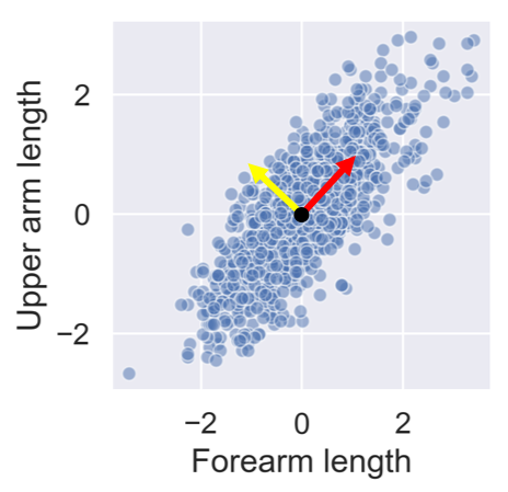
After standardizing the lower and upper arm lengths from the ANSUR dataset we’ve added two perpendicular vectors that are aligned with the main directions of variance. We can describe each point in the dataset as a combination of these two vectors multiplied with a value each. These values are then called principal components.
People with a negative component for the yellow vector have long forearms relative to their upper arms.


You’ll visually inspect a 4 feature sample of the ANSUR dataset before and after PCA using Seaborn’s
pairplot()
. This will allow you to inspect the pairwise correlations between the features.
# Create a pairplot to inspect ansur_df
sns.pairplot(ansur_df)

plt.show()

from sklearn.preprocessing import StandardScaler
from sklearn.decomposition import PCA

# Create the scaler
scaler = StandardScaler()
ansur_std = scaler.fit_transform(ansur_df)

# Create the PCA instance and fit and transform the data with pca
pca = PCA()
pc = pca.fit_transform(ansur_std)
pc_df = pd.DataFrame(pc, columns=['PC 1', 'PC 2', 'PC 3', 'PC 4'])

# Create a pairplot of the principal component dataframe
sns.pairplot(pc_df)
plt.show()

Notice how, in contrast to the input features, none of the principal components are correlated to one another.
You’ll now apply PCA on a somewhat larger ANSUR datasample with 13 dimensions, once again pre-loaded as
ansur_df
. The fitted model will be used in the next exercise. Since we are not using the principal components themselves there is no need to transform the data, instead, it is sufficient to fit
pca
to the data.
from sklearn.preprocessing import StandardScaler
from sklearn.decomposition import PCA

# Scale the data
scaler = StandardScaler()
ansur_std = scaler.fit_transform(ansur_df)

# Apply PCA
pca = PCA()
pca.fit(ansur_std)
You’ve fitted PCA on our 13 feature datasample. Now let’s see how the components explain the variance.
You’ll be inspecting the variance explained by the different principal components of the
pca
instance you created in the previous exercise.
# Inspect the explained variance ratio per component
print(pca.explained_variance_ratio_)

[0.61449404 0.19893965 0.06803095 0.03770499 0.03031502 0.0171759
 0.01072762 0.00656681 0.00634743 0.00436015 0.0026586  0.00202617
 0.00065268]
# Print the cumulative sum of the explained variance ratio
print(pca.explained_variance_ratio_.cumsum())

[0.61449404 0.81343368 0.88146463 0.91916962 0.94948464 0.96666054
 0.97738816 0.98395496 0.99030239 0.99466254 0.99732115 0.99934732
 1.        ]
What’s the lowest number of principal components you should keep if you don’t want to lose more than 10% of explained variance during dimensionality reduction?
4 principal components
Using no more than 4 principal components we can explain more than 90% of the variance in the 13 feature dataset.


You’ll apply PCA to the numeric features of the Pokemon dataset,
poke_df
, using a pipeline to combine the feature scaling and PCA in one go. You’ll then interpret the meanings of the first two components.
# Build the pipeline
pipe = Pipeline([('scaler', StandardScaler()),
        		 ('reducer', PCA(n_components=2))])

# Fit it to the dataset and extract the component vectors
pipe.fit(poke_df)
vectors = pipe.steps[1][1].components_.round(2)

# Print feature effects
print('PC 1 effects = ' + str(dict(zip(poke_df.columns, vectors[0]))))
print('PC 2 effects = ' + str(dict(zip(poke_df.columns, vectors[1]))))

PC 1 effects = {'Speed': 0.34, 'Sp. Def': 0.45, 'Defense': 0.36, 'Sp. Atk': 0.46, 'HP': 0.39, 'Attack': 0.44}
PC 2 effects = {'Speed': -0.67, 'Sp. Def': 0.24, 'Defense': 0.63, 'Sp. Atk': -0.31, 'HP': 0.08, 'Attack': -0.01}
You’ve used the pipeline for the first time and understand how the features relate to the components.
You’ll use the PCA pipeline you’ve built in the previous exercise to visually explore how some categorical features relate to the variance in
poke_df
. These categorical features (
Type
&
Legendary
) can be found in a separate dataframe
poke_cat_df
.
poke_df.head()
   HP  Attack  Defense  Sp. Atk  Sp. Def  Speed
0  45      49       49       65       65     45
1  60      62       63       80       80     60
2  80      82       83      100      100     80
3  80     100      123      122      120     80
4  39      52       43       60       50     65
pipe = Pipeline([('scaler', StandardScaler()),
                 ('reducer', PCA(n_components=2))])

# Fit the pipeline to poke_df and transform the data
pc = pipe.fit_transform(poke_df)
pc
[[-1.5563747  -0.02148212]
 [-0.36286656 -0.05026854]
 [ 1.28015158 -0.06272022]
 ...
 [ 2.45821626 -0.51588158]
 [ 3.5303971  -0.95106516]
 [ 2.23378629  0.53762985]]
# Add the 2 components to poke_cat_df
poke_cat_df['PC 1'] = pc[:, 0]
poke_cat_df['PC 2'] = pc[:, 1]
# Use the Type feature to color the PC 1 vs PC 2 scatterplot
sns.scatterplot(data=poke_cat_df,
                x='PC 1', y='PC 2', hue='Type')
plt.show()

# Use the Legendary feature to color the PC 1 vs PC 2 scatterplot
sns.scatterplot(data=poke_cat_df,
                x='PC 1', y='PC 2', hue='Legendary')
plt.show()

Looks like the different types are scattered all over the place while the legendary pokemon always score high for PC 1 meaning they have high stats overall. Their spread along the PC 2 axis tells us they aren’t consistently fast and vulnerable or slow and armored.
We just saw that legendary pokemon tend to have higher stats overall. Let’s see if we can add a classifier to our pipeline that detects legendary versus non-legendary pokemon based on the principal components.
# Build the pipeline
pipe = Pipeline([
        ('scaler', StandardScaler()),
        ('reducer', PCA(n_components=3)),
        ('classifier', RandomForestClassifier(random_state=0))])

# Fit the pipeline to the training data
pipe.fit(X_train, y_train)

# Score the accuracy on the test set
accuracy = pipe.score(X_test, y_test)

# Prints the explained variance ratio and accuracy
print(pipe.steps[1][1].explained_variance_ratio_)
print('{0:.1%} test set accuracy'.format(accuracy))
PCA(n_components=2)
[0.45624044 0.17767414]
95.8% test set accuracy
PCA(n_components=3)
[0.45624044 0.17767414 0.12858833]
95.0% test set accuracy
Looks like adding the third component does not increase the model accuracy, even though it adds information to the dataset.


You’ll let PCA determine the number of components to calculate based on an explained variance threshold that you decide.
# Let PCA select 90% of the variance
pipe = Pipeline([('scaler', StandardScaler()),
        		 ('reducer', PCA(n_components=0.9))])

# Fit the pipe to the data
pipe.fit(ansur_df)

print('{} components selected'.format(len(pipe.steps[1][1].components_)))
PCA(n_components=0.8)
11 components selected

PCA(n_components=0.9)
23 components selected
We need to more than double the components to go from 80% to 90% explained variance.
You’ll now make a more informed decision on the number of principal components to reduce your data to using the “elbow in the plot” technique.
# Pipeline a scaler and pca selecting 10 components
pipe = Pipeline([('scaler', StandardScaler()),
        		 ('reducer', PCA(n_components=10))])

# Fit the pipe to the data
pipe.fit(ansur_df)

# Plot the explained variance ratio
plt.plot(pipe.steps[1][1].explained_variance_ratio_)

plt.xlabel('Principal component index')
plt.ylabel('Explained variance ratio')
plt.show()

To how many components can you reduce the dataset without compromising too much on explained variance? Note that the x-axis is zero indexed.
The ‘elbow’ in the plot is at 3 components (the 3rd component has index 2).
You’ll reduce the size of 16 images with hand written digits (MNIST dataset) using PCA.
The samples are 28 by 28 pixel gray scale images that have been flattened to arrays with 784 elements each (28 x 28 = 784) and added to the 2D numpy array
X_test
. Each of the 784 pixels has a value between 0 and 255 and can be regarded as a feature.
A pipeline with a scaler and PCA model to select 78 components has been pre-loaded for you as
pipe
. This pipeline has already been fitted to the entire MNIST dataset except for the 16 samples in
X_test
.
Finally, a function
plot_digits
has been created for you that will plot 16 images in a grid.
# Plot the MNIST sample data
plot_digits(X_test)

pipe
Pipeline(memory=None,
     steps=[('scaler', StandardScaler(copy=True, with_mean=True, with_std=True)), ('reducer', PCA(copy=True, iterated_power='auto', n_components=78, random_state=None,
  svd_solver='auto', tol=0.0, whiten=False))])
# Transform the input data to principal components
pc = pipe.transform(X_test)

# Prints the number of features per dataset
print("X_test has {} features".format(X_test.shape[1]))
print("pc has {} features".format(pc.shape[1]))

#    X_test has 784 features
#    pc has 78 features

# Inverse transform the components to original feature space
X_rebuilt = pipe.inverse_transform(pc)

# Prints the number of features
print("X_rebuilt has {} features".format(X_rebuilt.shape[1]))
# X_rebuilt has 784 features

# Plot the reconstructed data
plot_digits(X_rebuilt)

You’ve reduced the size of the data 10 fold but were able to reconstruct images with reasonable quality.
### The End

Thank you for reading and hope you’ve learned a lot.