This is the memo of the 6th course (23 courses in all) of ‘Machine Learning Scientist with Python’ skill track.
You can find the original course HERE .
### Course Description
You have probably come across Google News, which automatically groups similar news articles under a topic. Have you ever wondered what process runs in the background to arrive at these groups? In this course, you will be introduced to unsupervised learning through clustering using the SciPy library in Python. This course covers pre-processing of data and application of hierarchical and k-means clustering. Through the course, you will explore player statistics from a popular football video game, FIFA 18. After completing the course, you will be able to quickly apply various clustering algorithms on data, visualize the clusters formed and analyze results.
### Table of contents
Which of the following examples can be solved with unsupervised learning?
There have been reports of sightings of rare, legendary Pokémon. You have been asked to investigate! Plot the coordinates of sightings to find out where the Pokémon might be. The X and Y coordinates of the points are stored in list
x
and
y
, respectively.
# Import plotting class from matplotlib library
from matplotlib import pyplot as plt

# Create a scatter plot
plt.scatter(x, y)

# Display the scatter plot
plt.show()

Notice the areas where the sightings are dense. This indicates that there is not one, but two legendary Pokémon out there!


#### Hierarchical clustering algorithms


#### K-means clustering algorithms


We are going to continue the investigation into the sightings of legendary Pokémon from the previous exercise. Remember that in the scatter plot of the previous exercise, you identified two areas where Pokémon sightings were dense. This means that the points seem to separate into two clusters. In this exercise, you will form two clusters of the sightings using hierarchical clustering.
df.head()
   x   y
0  9   8
1  6   4
2  2  10
3  3   6
4  1   0
# Import linkage and fcluster functions
from scipy.cluster.hierarchy import linkage, fcluster

# Use the linkage() function to compute distance
Z = linkage(df, 'ward')

# Generate cluster labels
df['cluster_labels'] = fcluster(Z, 2, criterion='maxclust')

# Plot the points with seaborn
sns.scatterplot(x='x', y='y', hue='cluster_labels', data=df)
plt.show()
type(Z)
numpy.ndarray

Z[:3]
array([[10., 13.,  0.,  2.],
       [15., 19.,  0.,  2.],
       [ 1.,  5.,  1.,  2.]])

df
     x   y  cluster_labels
0    9   8               2
1    6   4               2
...
8    1   6               2
9    7   1               2
10  23  29               1
11  26  25               1
...

Notice that the cluster labels are plotted with different colors. You will notice that the resulting plot has an extra cluster labelled 0 in the legend. This will be explained later in the course.
We are going to continue the investigation into the sightings of legendary Pokémon from the previous exercise. Just like the previous exercise, we will use the same example of Pokémon sightings. In this exercise, you will form clusters of the sightings using k-means clustering.
# Import kmeans and vq functions
from scipy.cluster.vq import kmeans, vq

# Compute cluster centers
centroids,_ = kmeans(df, 2)

# Assign cluster labels
df['cluster_labels'], _ = vq(df, centroids)

# Plot the points with seaborn
sns.scatterplot(x='x', y='y', hue='cluster_labels', data=df)
plt.show()
centroids
array([[23.7, 28. ],
       [ 4.3,  5.9]])

Notice that in this case, the results of both types of clustering are similar. We will look at distinctly different results later in the course.


Now that you are aware of normalization, let us try to normalize some data.
goals_for
is a list of goals scored by a football team in their last ten matches. Let us standardize the data using the
whiten()
function.
# Import the whiten function
from scipy.cluster.vq import whiten

goals_for = [4,3,2,3,1,1,2,0,1,4]

# Use the whiten() function to standardize the data
scaled_data = whiten(goals_for)
print(scaled_data)
# [3.07692308 2.30769231 1.53846154 2.30769231 0.76923077 0.76923077
 1.53846154 0.         0.76923077 3.07692308]
After normalizing your data, you can compare the scaled data to the original data to see the difference. The variables from the last exercise,
goals_for
and
scaled_data
are already available to you.
# Plot original data
plt.plot(goals_for, label='original')

# Plot scaled data
plt.plot(scaled_data, label='scaled')

# Show the legend in the plot
plt.legend()

# Display the plot
plt.show()

In earlier examples, you have normalization of whole numbers. In this exercise, you will look at the treatment of fractional numbers – the change of interest rates in the country of Bangalla over the years.
# Prepare data
rate_cuts = [0.0025, 0.001, -0.0005, -0.001, -0.0005, 0.0025, -0.001, -0.0015, -0.001, 0.0005]

# Use the whiten() function to standardize the data
scaled_data = whiten(rate_cuts)

# Plot original data
plt.plot(rate_cuts, label='original')

# Plot scaled data
plt.plot(scaled_data, label='scaled')

plt.legend()
plt.show()

Notice how the changes in the original data are negligible as compared to the scaled data
FIFA 18 is a football video game that was released in 2017 for PC and consoles. The dataset that you are about to work on contains data on the 1000 top individual players in the game. You will explore various features of the data as we move ahead in the course. In this exercise, you will work with two columns,
eur_wage
, the wage of a player in Euros and
eur_value
, their current transfer market value.
The data for this exercise is stored in a Pandas dataframe,
fifa
.
whiten
from
scipy.cluster.vq
and
matplotlib.pyplot
as
plt
have been pre-loaded.
# Scale wage and value
fifa['scaled_wage'] = whiten(fifa['eur_wage'])
fifa['scaled_value'] = whiten(fifa['eur_value'])

# Plot the two columns in a scatter plot
fifa.plot(x='scaled_wage', y='scaled_value', kind = 'scatter')
plt.show()

# Check mean and standard deviation of scaled values
print(fifa[['scaled_wage', 'scaled_value']].describe())
       scaled_wage  scaled_value
count      1000.00       1000.00
mean          1.12          1.31
std           1.00          1.00
min           0.00          0.00
25%           0.47          0.73
50%           0.85          1.02
75%           1.41          1.54
max           9.11          8.98

As you can see the scaled values have a standard deviation of 1.


It is time for Comic-Con! Comic-Con is an annual comic-based convention held in major cities in the world. You have the data of last year’s footfall, the number of people at the convention ground at a given time.
You would like to decide the location of your stall to maximize sales. Using the ward method, apply hierarchical clustering to find the two points of attraction in the area.
comic_con
    x_coordinate  y_coordinate  x_scaled  y_scaled
0             17             4  0.509349  0.090010
1             20             6  0.599234  0.135015
2             35             0  1.048660  0.000000
3             14             0  0.419464  0.000000
4             37             4  1.108583  0.090010
5             33             3  0.988736  0.067507
6             14             1  0.419464  0.022502
# Import the fcluster and linkage functions
from scipy.cluster.hierarchy import linkage, fcluster

# Use the linkage() function
distance_matrix = linkage(comic_con[['x_scaled', 'y_scaled']], method = 'ward', metric = 'euclidean')

# Assign cluster labels
comic_con['cluster_labels'] = fcluster(distance_matrix, 2, criterion='maxclust')

# Plot clusters
sns.scatterplot(x='x_scaled', y='y_scaled',
                hue='cluster_labels', data = comic_con)
plt.show()

Notice the two clusters correspond to the points of attractions in the figure towards the bottom (a stage) and the top right (an interesting stall).
Let us use the same footfall dataset and check if any changes are seen if we use a different method for clustering.
# Import the fcluster and linkage functions
from scipy.cluster.hierarchy import fcluster, linkage

# Use the linkage() function
distance_matrix = linkage(comic_con[['x_scaled', 'y_scaled']], method = 'single', metric = 'euclidean')

# Assign cluster labels
comic_con['cluster_labels'] = fcluster(distance_matrix, 2, criterion='maxclust')

# Plot clusters
sns.scatterplot(x='x_scaled', y='y_scaled',
                hue='cluster_labels', data = comic_con)
plt.show()
Notice that in this example, the clusters formed are not different from the ones created using the ward method.
For the third and final time, let us use the same footfall dataset and check if any changes are seen if we use a different method for clustering.
# Import the fcluster and linkage functions
from scipy.cluster.hierarchy import linkage, fcluster

# Use the linkage() function
distance_matrix = linkage(comic_con[['x_scaled', 'y_scaled']], method='complete', metric='euclidean')

# Assign cluster labels
comic_con['cluster_labels'] = fcluster(distance_matrix,2,criterion='maxclust')

# Plot clusters
sns.scatterplot(x='x_scaled', y='y_scaled',
                hue='cluster_labels', data = comic_con)
plt.show()
Coincidentally, the clusters formed are not different from the ward or single methods. Next, let us learn how to visualize clusters.


We have discussed that visualizations are necessary to assess the clusters that are formed and spot trends in your data. Let us now focus on visualizing the footfall dataset from Comic-Con using the
matplotlib
module.
# Import the pyplot class
from matplotlib import pyplot as plt

# Define a colors dictionary for clusters
colors = {1:'red', 2:'blue'}

# Plot a scatter plot
comic_con.plot.scatter(x = 'x_scaled',
                	   y = 'y_scaled',
                	   c = comic_con['cluster_labels'].apply(lambda x: colors[x]))
plt.show()

Let us now visualize the footfall dataset from Comic Con using the
seaborn
module. Visualizing clusters using
seaborn
is easier with the inbuild
hue
function for cluster labels.
# Import the seaborn module
import seaborn as sns

# Plot a scatter plot using seaborn
sns.scatterplot(x='x_scaled',
                y='y_scaled',
                hue='cluster_labels',
                data = comic_con)
plt.show()

Notice the legend is automatically shown when using the
hue
argument.


Dendrograms are branching diagrams that show the merging of clusters as we move through the distance matrix. Let us use the Comic Con footfall data to create a dendrogram.
# Import the dendrogram function
from scipy.cluster.hierarchy import dendrogram

# Create a dendrogram
dn = dendrogram(distance_matrix)

# Display the dendogram
plt.show()


In the FIFA 18 dataset, various attributes of players are present. Two such attributes are:
These are typically high in defense-minded players. In this exercise, you will perform clustering based on these attributes in the data.
fifa.head()
   sliding_tackle  aggression  ...  scaled_aggression  cluster_labels
0              23          63  ...               3.72               3
1              26          48  ...               2.84               3
2              33          56  ...               3.31               3
3              38          78  ...               4.61               3
4              11          29  ...               1.71               2

[5 rows x 5 columns]
# Fit the data into a hierarchical clustering algorithm
distance_matrix = linkage(fifa[['scaled_sliding_tackle', 'scaled_aggression']], 'ward')

# Assign cluster labels to each row of data
fifa['cluster_labels'] = fcluster(distance_matrix, 3, criterion='maxclust')

# Display cluster centers of each cluster
print(fifa[['scaled_sliding_tackle', 'scaled_aggression', 'cluster_labels']].groupby('cluster_labels').mean())

# Create a scatter plot through seaborn
sns.scatterplot(x='scaled_sliding_tackle', y='scaled_aggression', hue='cluster_labels', data=fifa)
plt.show()
                scaled_sliding_tackle  scaled_aggression
cluster_labels
1                                2.99               4.35
2                                0.74               1.94
3                                1.34               3.62


This exercise will familiarize you with the usage of k-means clustering on a dataset. Let us use the Comic Con dataset and check how k-means clustering works on it.
Recall the two steps of k-means clustering:
kmeans()
function. It has two required arguments: observations and number of clusters.vq()
function. It has two required arguments: observations and cluster centers.
# Import the kmeans and vq functions
from scipy.cluster.vq import kmeans, vq

# Generate cluster centers
cluster_centers, distortion = kmeans(comic_con[['x_scaled','y_scaled']], 2)

# Assign cluster labels
comic_con['cluster_labels'], distortion_list = vq(comic_con[['x_scaled','y_scaled']],cluster_centers)

# Plot clusters
sns.scatterplot(x='x_scaled', y='y_scaled',
                hue='cluster_labels', data = comic_con)
plt.show()

Notice that the clusters formed are exactly the same as hierarchical clustering that you did in the previous chapter.
Recall that it took a significantly long time to run hierarchical clustering. How long does it take to run the
kmeans()
function on the FIFA dataset?
%timeit kmeans(fifa[['scaled_sliding_tackle','scaled_aggression']],3)
# 10 loops, best of 3: 69.7 ms per loop

%timeit linkage(fifa[['scaled_sliding_tackle','scaled_aggression']], method = 'ward', metric = 'euclidean')
# 1 loop, best of 3: 703 ms per loop


Let us use the comic con data set to see how the elbow plot looks on a data set with distinct, well-defined clusters. You may want to display the data points before proceeding with the exercise.
distortions = []
num_clusters = range(1, 7)

# Create a list of distortions from the kmeans function
for i in num_clusters:
    cluster_centers, distortion = kmeans(comic_con[['x_scaled','y_scaled']],i)
    distortions.append(distortion)

# Create a data frame with two lists - num_clusters, distortions
elbow_plot = pd.DataFrame({'num_clusters': num_clusters, 'distortions': distortions})

# Creat a line plot of num_clusters and distortions
sns.lineplot(x='num_clusters', y='distortions', data = elbow_plot)
plt.xticks(num_clusters)
plt.show()

From the elbow plot, there are 2 clusters in the data.
In the earlier exercise, you constructed an elbow plot on data with well-defined clusters. Let us now see how the elbow plot looks on a data set with uniformly distributed points. You may want to display the data points on the console before proceeding with the exercise.
distortions = []
num_clusters = range(2, 7)

# Create a list of distortions from the kmeans function
for i in num_clusters:
    cluster_centers, distortion = kmeans(uniform_data[['x_scaled','y_scaled']],i)
    distortions.append(distortion)

# Create a data frame with two lists - number of clusters and distortions
elbow_plot = pd.DataFrame({'num_clusters': num_clusters, 'distortions': distortions})

# Creat a line plot of num_clusters and distortions
sns.lineplot(x='num_clusters', y='distortions', data = elbow_plot)
plt.xticks(num_clusters)
plt.show()

From the elbow plot, we can not determine how many clusters in the data.


You noticed the impact of seeds on a dataset that did not have well-defined groups of clusters. In this exercise, you will explore whether seeds impact the clusters in the Comic Con data, where the clusters are well-defined.
# Import random class
from numpy import random

# Initialize seed
random.seed(0)
random.seed([1, 2, 1000])

# Run kmeans clustering
cluster_centers, distortion = kmeans(comic_con[['x_scaled', 'y_scaled']], 2)
comic_con['cluster_labels'], distortion_list = vq(comic_con[['x_scaled', 'y_scaled']], cluster_centers)

# Plot the scatterplot
sns.scatterplot(x='x_scaled', y='y_scaled',
                hue='cluster_labels', data = comic_con)
plt.show()

Notice that the plots have not changed after changing the seed as the clusters are well-defined.
Now that you are familiar with the impact of seeds, let us look at the bias in k-means clustering towards the formation of uniform clusters.
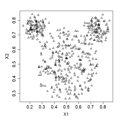
Let us use a mouse-like dataset for our next exercise. A mouse-like dataset is a group of points that resemble the head of a mouse: it has three clusters of points arranged in circles, one each for the face and two ears of a mouse.
Here is how a typical mouse-like dataset looks like ( Source ).
# Import the kmeans and vq functions
from scipy.cluster.vq import kmeans, vq

# Generate cluster centers
cluster_centers, distortion = kmeans(mouse[['x_scaled','y_scaled']],3)

# Assign cluster labels
mouse['cluster_labels'], distortion_list = vq(mouse[['x_scaled','y_scaled']],cluster_centers)

# Plot clusters
sns.scatterplot(x='x_scaled', y='y_scaled',
                hue='cluster_labels', data = mouse)
plt.show()

Notice that kmeans is unable to capture the three visible clusters clearly, and the two clusters towards the top have taken in some points along the boundary. This happens due to the underlying assumption in kmeans algorithm to minimize distortions which leads to clusters that are similar in terms of area.
In the FIFA 18 dataset, various attributes of players are present. Two such attributes are:
These are typically defense-minded players. In this exercise, you will perform clustering based on these attributes in the data.
# Set up a random seed in numpy
random.seed([1000,2000])

# Fit the data into a k-means algorithm
cluster_centers,_ = kmeans(fifa[['scaled_def', 'scaled_phy']], 3)

# Assign cluster labels
fifa['cluster_labels'], _ = vq(fifa[['scaled_def', 'scaled_phy']], cluster_centers)

# Display cluster centers
print(fifa[['scaled_def', 'scaled_phy', 'cluster_labels']].groupby('cluster_labels').mean())

# Create a scatter plot through seaborn
sns.scatterplot(x='scaled_def', y='scaled_phy', hue='cluster_labels', data=fifa)
plt.show()
                scaled_def  scaled_phy
cluster_labels
0                     3.74        8.87
1                     1.87        7.08
2                     2.10        8.94

Notice that the seed has an impact on clustering as the data is uniformly distributed.


There are broadly three steps to find the dominant colors in an image:
To extract RGB values, we use the
imread()
function of the
image
class of
matplotlib
. Empty lists,
r
,
g
and
b
have been initialized.
For the purpose of finding dominant colors, we will be using the following image.

# Import image class of matplotlib
from matplotlib import image as img

# Read batman image and print dimensions
batman_image = img.imread('batman.jpg')
print(batman_image.shape)
# (57, 90, 3)

# Store RGB values of all pixels in lists r, g and b
for rows in batman_image:
    for temp_r, temp_g, temp_b in rows:
        r.append(temp_r)
        g.append(temp_g)
        b.append(temp_b)
You have successfully extracted the RGB values of the image into three lists, one for each color channel.
#### 4.1.2 How many dominant colors?
The RGB values are stored in a data frame,
batman_df
. The RGB values have been standardized used the
whiten()
function, stored in columns,
scaled_red
,
scaled_blue
and
scaled_green
.
Construct an elbow plot with the data frame. How many dominant colors are present?
distortions = []
num_clusters = range(1, 7)

# Create a list of distortions from the kmeans function
for i in num_clusters:
    cluster_centers, distortion = kmeans(batman_df[['scaled_red', 'scaled_blue', 'scaled_green']], i)
    distortions.append(distortion)

# Create a data frame with two lists, num_clusters and distortions
elbow_plot = pd.DataFrame({'num_clusters':num_clusters,'distortions':distortions})

# Create a line plot of num_clusters and distortions
sns.lineplot(x='num_clusters', y='distortions', data = elbow_plot)
plt.xticks(num_clusters)
plt.show()

Notice that there are three distinct colors present in the image, which is supported by the elbow plot.
To display the dominant colors, convert the colors of the cluster centers to their raw values and then converted them to the range of 0-1, using the following formula:
converted_pixel = standardized_pixel * pixel_std / 255
# Get standard deviations of each color
r_std, g_std, b_std = batman_df[['red', 'green', 'blue']].std()

for cluster_center in cluster_centers:
    scaled_r, scaled_g, scaled_b = cluster_center
    # Convert each standardized value to scaled value
    colors.append((
        scaled_r * r_std / 255,
        scaled_g * g_std / 255,
        scaled_b * b_std / 255
    ))

# Display colors of cluster centers
plt.imshow([colors])
plt.show()

Notice the three colors resemble the three that are indicative from visual inspection of the image.


Let us use the plots of randomly selected movies to perform document clustering on. Before performing clustering on documents, they need to be cleaned of any unwanted noise (such as special characters and stop words) and converted into a sparse matrix through TF-IDF of the documents.
Use the
TfidfVectorizer
class to perform the TF-IDF of movie plots stored in the list
plots
. The
remove_noise()
function is available to use as a
tokenizer
in the
TfidfVectorizer
class. The
.fit_transform()
method fits the data into the
TfidfVectorizer
objects and then generates the TF-IDF sparse matrix.
plots[:1]
['Cable Hogue is isolated in the desert, awaiting his partners, Taggart and Bowen,
...
...
A coyote wanders into the abandoned Cable Springs. But the coyote has a collar – possibly symbolising the taming of the wilderness.']
# Import TfidfVectorizer class from sklearn
from sklearn.feature_extraction.text import TfidfVectorizer

# Initialize TfidfVectorizer
tfidf_vectorizer = TfidfVectorizer(min_df=0.1, max_df=0.75, max_features=50, tokenizer=remove_noise)

# Use the .fit_transform() method on the list plots
tfidf_matrix = tfidf_vectorizer.fit_transform(plots)
Now that you have created a sparse matrix, generate cluster centers and print the top three terms in each cluster. Use the
.todense()
method to convert the sparse matrix,
tfidf_matrix
to a normal matrix for the
kmeans()
function to process. Then, use the
.get_feature_names()
method to get a list of terms in the
tfidf_vectorizer
object. The
zip()
function in Python joins two lists.
The
tfidf_vectorizer
object and sparse matrix,
tfidf_matrix
, from the previous have been retained in this exercise.
kmeans
has been imported from SciPy.
With a higher number of data points, the clusters formed would be defined more clearly. However, this requires some computational power, making it difficult to accomplish in an exercise here.
num_clusters = 2

# Generate cluster centers through the kmeans function
cluster_centers, distortion = kmeans(tfidf_matrix.todense(),num_clusters)

# Generate terms from the tfidf_vectorizer object
terms = tfidf_vectorizer.get_feature_names()

for i in range(num_clusters):
    # Sort the terms and print top 3 terms
    center_terms = dict(zip(terms, cluster_centers[i]))
    sorted_terms = sorted(center_terms, key=center_terms.get, reverse=True)
    print(sorted_terms[:3])

# ['back', 'father', 'one']
# ['man', 'police', 'killed']
Notice positive, warm words in the first cluster and words referring to action in the second cluster.


What should you do if you have too many features for clustering?
Reduce features using a technique like Factor Analysis
In the FIFA 18 dataset, we have concentrated on defenders in previous exercises. Let us try to focus on attacking attributes of a player. Pace (
pac
), Dribbling (
dri
) and Shooting (
sho
) are features that are present in attack minded players. In this exercise, k-means clustering has already been applied on the data using the scaled values of these three attributes. Try some basic checks on the clusters so formed.
The data is stored in a Pandas data frame,
fifa
. The scaled column names are present in a list
scaled_features
. The cluster labels are stored in the
cluster_labels
column. Recall the
.count()
and
.mean()
methods in Pandas help you find the number of observations and mean of observations in a data frame.
# Print the size of the clusters
print(fifa.groupby('cluster_labels')['ID'].count())

# Print the mean value of wages in each cluster
print(fifa.groupby('cluster_labels')['eur_wage'].mean())
cluster_labels
0     83
1    107
2     60
Name: ID, dtype: int64

cluster_labels
0   132108.43
1   130308.41
2   117583.33
Name: eur_wage, dtype: float64
In this example, the cluster sizes are not very different, and there are no significant differences that can be seen in the wages. Further analysis is required to validate these clusters.
The overall level of a player in FIFA 18 is defined by six characteristics: pace (
pac
), shooting (
sho
), passing (
pas
), dribbling (
dri
), defending (
def
), physical (
phy
).
# Create centroids with kmeans for 2 clusters
cluster_centers,_ = kmeans(fifa[scaled_features], 2)

# Assign cluster labels and print cluster centers
fifa['cluster_labels'], _ = vq(fifa[scaled_features], cluster_centers)
print(fifa.groupby('cluster_labels')[scaled_features].mean())

# Plot cluster centers to visualize clusters
fifa.groupby('cluster_labels')[scaled_features].mean().plot(legend=True, kind='bar')
plt.show()

# Get the name column of top 5 players in each cluster
for cluster in fifa['cluster_labels'].unique():
    print(cluster, fifa[fifa['cluster_labels'] == cluster]['name'].values[:5])
                scaled_pac  scaled_sho  scaled_pas  scaled_dri  scaled_def  \
cluster_labels
0                     6.68        5.43        8.46        8.51        2.50
1                     5.44        3.66        7.17        6.76        3.97

                scaled_phy
cluster_labels
0                     8.34
1                     9.21


0 ['Cristiano Ronaldo' 'L. Messi' 'Neymar' 'L. Suárez' 'M. Neuer']
1 ['Sergio Ramos' 'G. Chiellini' 'D. Godín' 'Thiago Silva' 'M. Hummels']

Notice the top players in each cluster are representative of the overall characteristics of the cluster – one of the clusters primarily represents attackers, whereas the other represents defenders.
Surprisingly, a top goalkeeper Manuel Neuer is seen in the attackers group, but he is known for going out of the box and participating in open play, which are reflected in his FIFA 18 attributes.
Thank you for reading and hope you’ve learned a lot.